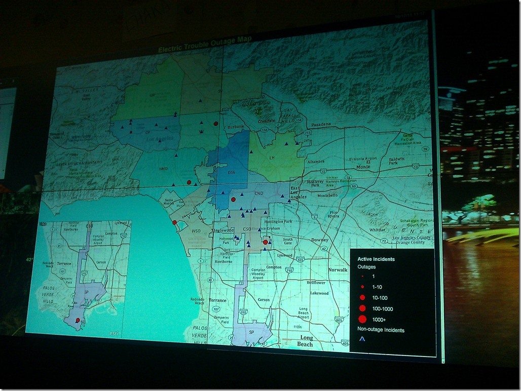
Recently, the major electric utility that I work for installed a wall full of 50”displays in their power outage response control center, and they asked me to start generating content for it. The content would be real-time summary data of the power outages across the utility’s electric distribution network, and the centerpiece was to be a map showing the location of all the current power outages affecting their customers. This was an exciting challenge for me, since I’ve never created applications to be run on large screens with no human interface devices – keyboards, mice, etc. I was particularly excited about figuring out how to implement the map, since I typically develop mapping applications that are meant to be experienced inside of a web browser.
A Web Implementation Strategy
The entire display wall is powered by ActiVu software, which basically projects a very large Windows desktop across the array of screens. So, in theory, the content could come from any kind of application. Most of the content that we wanted to display already appeared on web pages on an intranet site, so the fastest way to get the content on the wall without creating new applications was to just open those pages via ActiVu’s browser and fit them into a mosaic across the wall. However, after getting content up in just a few clicks, it was soon obvious that those pages would need to be reformatted to work on the big screen. Again, the web turned out to be a nifty solution, because I was able to accomplish that by simply adding a new CSS style sheet that was invoked when requested from these screens.
With the rest of the wall’s content coming form web pages, why not try putting up our existing Bing Maps based power outage web map? While that worked, it wasn’t pretty. This map was originally designed to be displayed by our field crews running IE6 a 1024 x 768 laptop across a wireless connection. So, we were going to build a new map. While a desktop solution may have been possible (i.e. leaving a copy of ArcMap open on the display server), we chose to implement it as a web map using the ArcGIS JavaScript API for the following reasons.
A 5ft Tall JavaScript Map, Really?
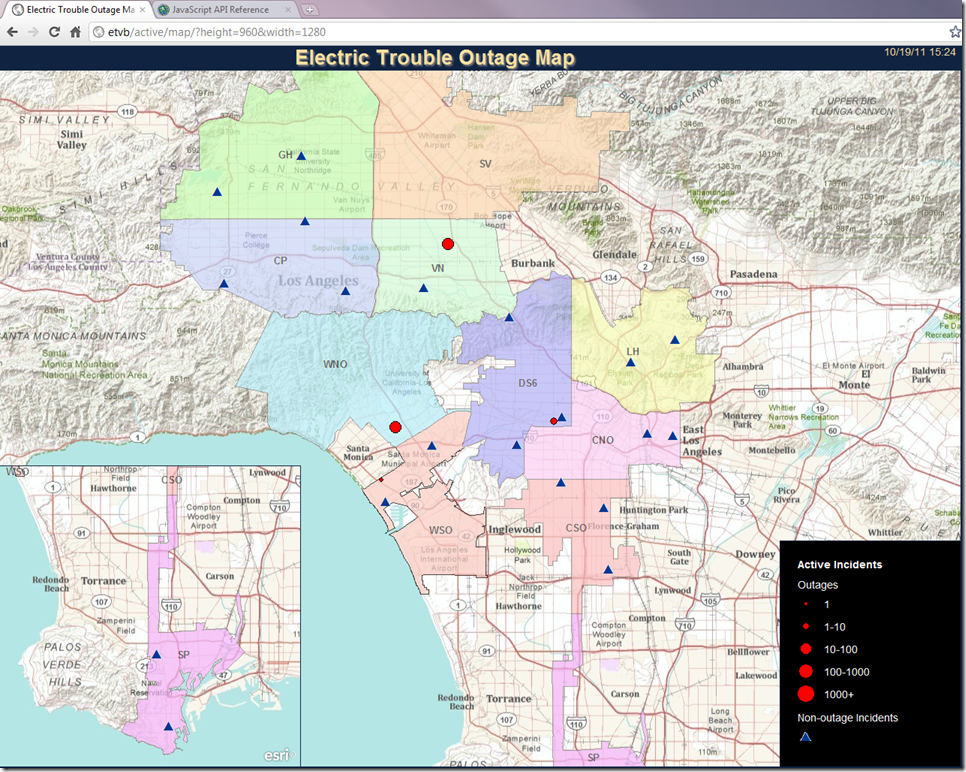
While I considered using the ArcGIS Server REST API’s export option to generate fresh PNG images at the correct resolution every few minutes, I decided that an HTML5 web page with a small amount of JavaScript could do the job better. The HTML5/JavaScript implementation is ideal because after the initial request for base and static map layer tiles, the dynamic content could be implemented as a graphics layer that refreshed only as frequently as needed. Though the same could be achieved with Esri’s other web APIS (Flex, JavaScript), I chose HTML5 and JavaScript because I would need fine grained control over the layout, fonts, etc. I was also able to overlay my own custom inset map and the legend widget to make better use of the dead space around the edges of the map. The best part is that the same map can be displayed in a web browser on a user’s desktop at “normal” resolutions because I set the size dynamically in the JavaScript. Below is a screenshot taken at 1280 by 960 pixels:
What’s Next for the Big Web Map?
The initial feedback from the users has been very positive, but they had one main suggestion and that was to use color as well as size gradients for the outage symbols to differentiate the outages by the number of affected customers. That’s an easy fix. We also plan to add other operational data such as the locations of working crews as well as contextual information such as weather, earthquakes, etc. Fortunately, the contextual information is already exposed as public Esri map services from other agencies. The trick is going to be figuring out how to control the visibility of that data without any direct interaction from the user. One possibility is to create a simple administration interface where a senior dispatcher can control what content is available on the map at a given time. Another would be to cycle through a series of pre-defined “views” each with different kinds of contextual information behind the outages. Whatever we end up doing next, I’m really going to enjoy working on the solution!

